Write your JavaScript
In this step, we will:
- Add a click and keyup listener to the follow button
- Set a following state on element and update our template accordingly
- Add a profile photo attribute
First, we'll listen for triggering events on the button.
We can declare an event listener on the <button> in our shadow root using lit-html's event listener syntax:
render() {
return html`
<div id="profile-pic"></div>
<slot></slot>
<div id="social">
<button @click="${this.#onClick}">Follow</button>
</div>
`;
}
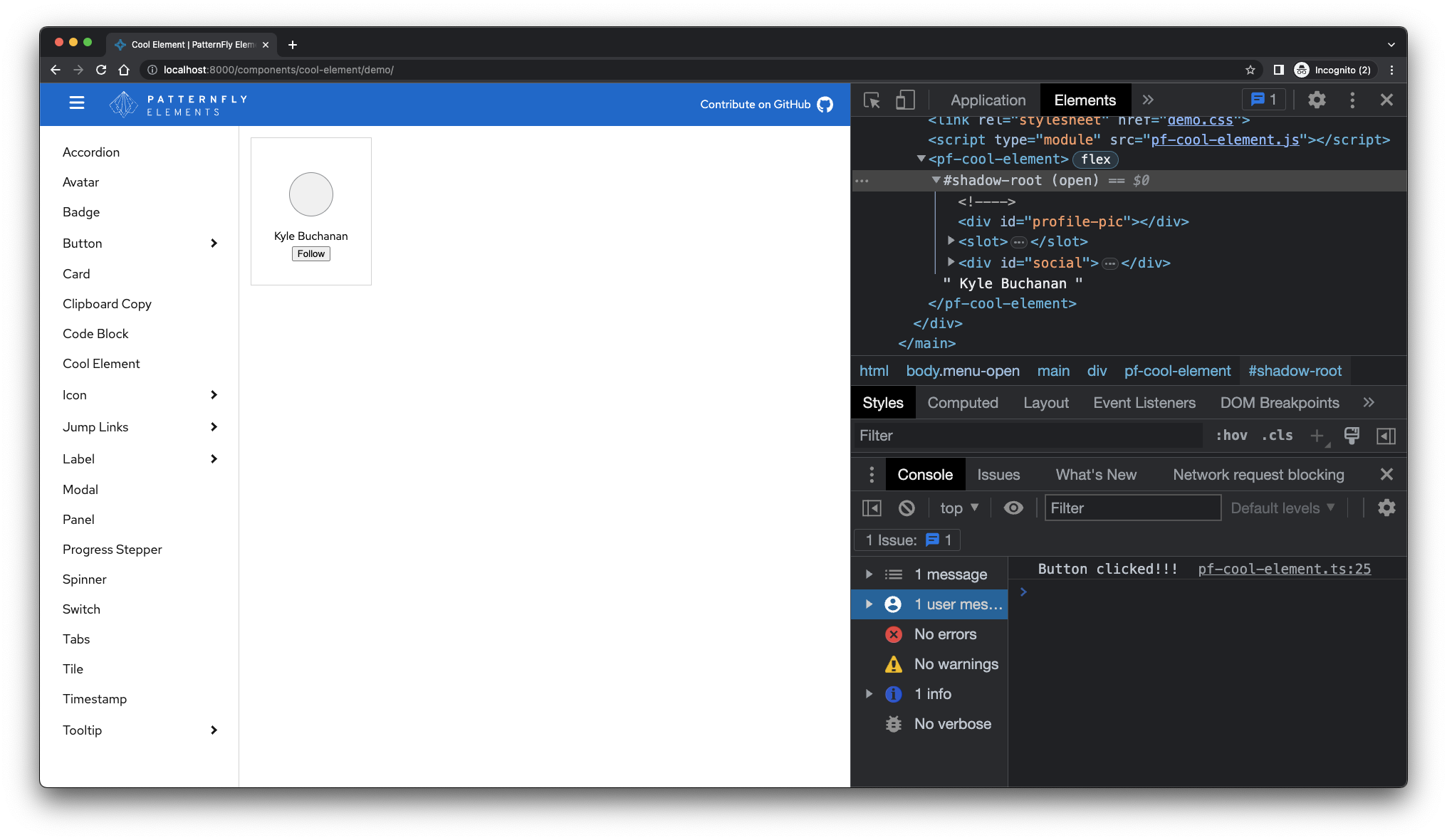
#onClick() {
console.log("Button clicked!!!");
}Note that when event listeners are bound in this way,
lit-element automatically binds the handler method's this reference to the host class,
i.e. to our PfeCoolElement instance.
Please note the TypeScript # character before the handlers' method name.
This signals to the custom elements manifest analyzer to list this method as private,
and marks it as such in the element's TypeScript definition file.
This helps users of your element know which of its features are safe to use with confidence,
and which are likely to change without notice. For example, a user of <pf-v5-cool-element> would think twice about directly calling it's
onClick() method if it was marked as private.
After saving your files, the demo page will refresh and you'll notice the start of your button interactivity.
Properties
When a user clicks our "Follow" button, we'd like to update the state of the component to indicate whether the user is "following" or not. To do this, we'll add a property to our component that will maintain the state.
In TypeScript, lit observed properties are defined using either the @property() decorator (for public properties and attributes)
or the @state() decorator (for private or internal properties). Add the property import statement.
import { customElement } from 'lit/decorators/custom-element.js'
import { property } from 'lit/decorators/property.js'
Then define the following boolean attribute on the element.
export class PfV5CoolElement extends LitElement {
  static readonly styles = [style];

  /** Whether the user follows this profile */
  @property({ type: Boolean, reflect: true }) following = false;

  // ...
}
Notice the block comment above the property declaration. This is called a JSDoc docblock, and it's contents will eventually end up in the custom elements manifest for this package. It's important to add a helpful description of every public property and method on your element's class. Learn more about how to document components.
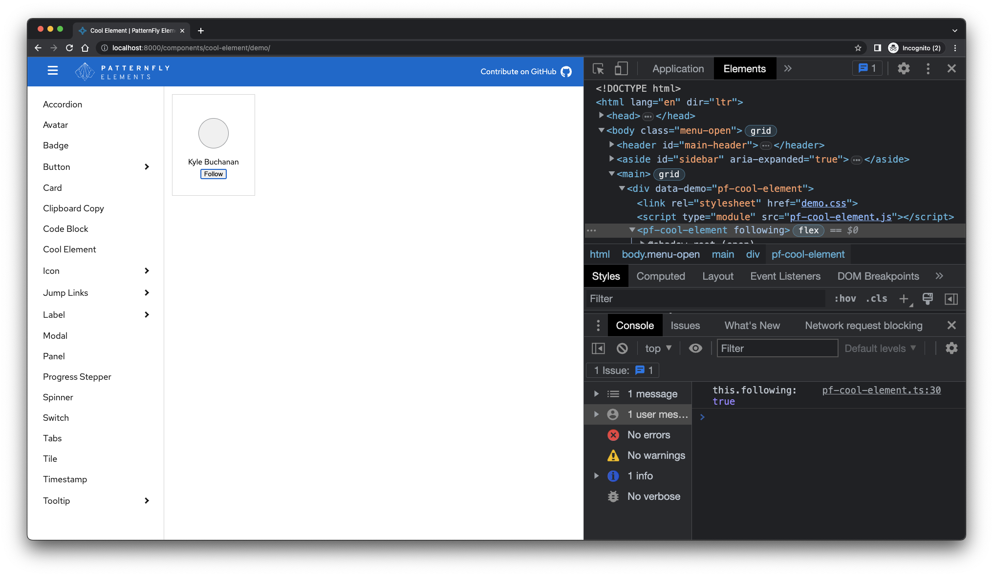
Now that we have declared the follow property, we can toggle it in our private onClick handler.
#onClick() {
  this.following = !this.following;
  console.log('this.following: ', this.following);
}
Note that we declare the property has type: Boolean and that it reflects.
This means that following is a "boolean attribute" - considered true when present and false when absent.
"Reflecting" properties are those which, when set, automatically set (or remove) their corresponding attribute.
Observed properties
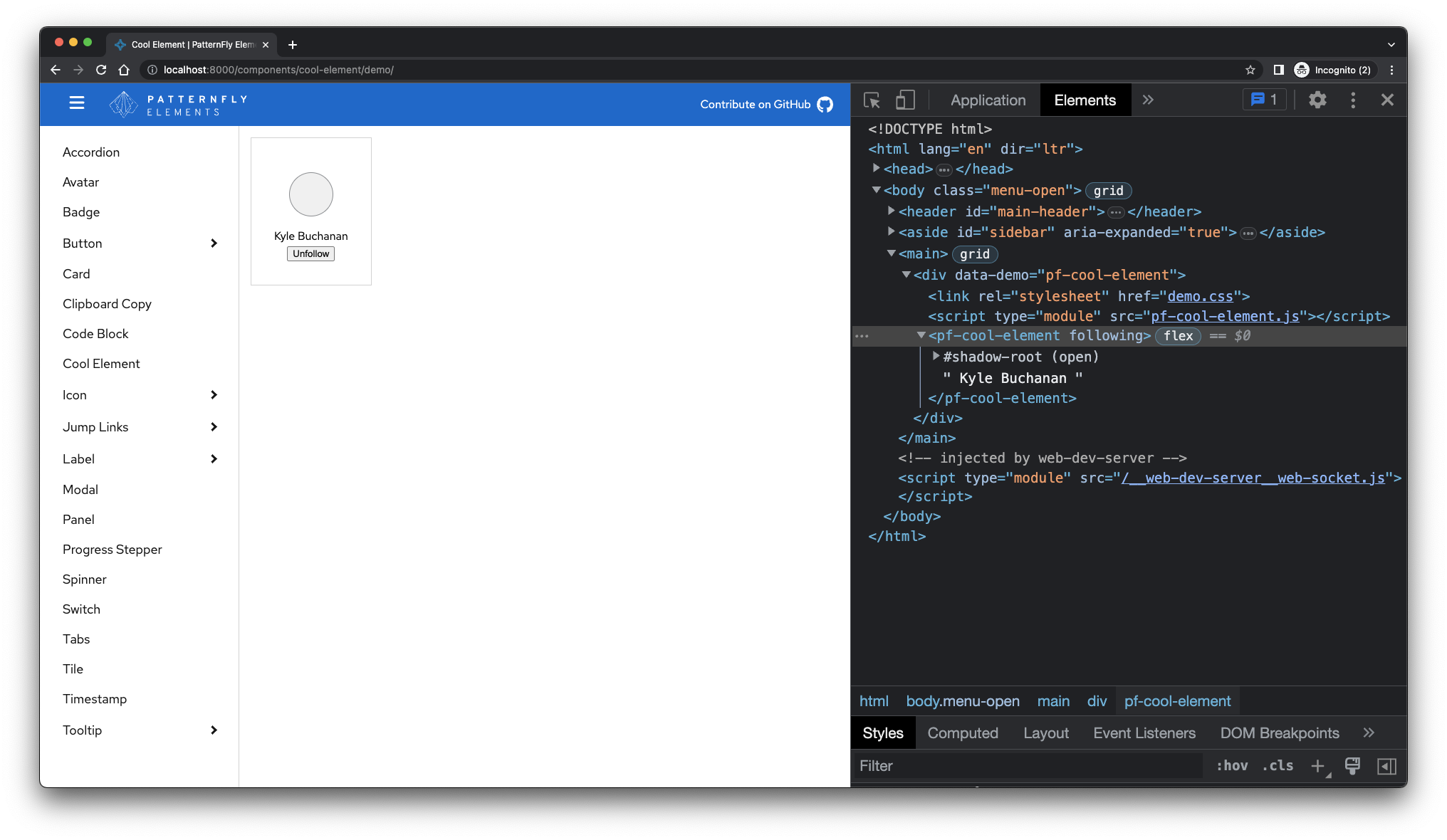
Let's add one more thing with the follow property.
We should update the button's text to "Unfollow" when this.following is true and to "Follow" when this.following is false.
Lit's observed properties automatically request a re-render when they change. So we can use the property in our render method,
and be confident that our element's template will stay up-to-date.
render() {
  const message = this.following ? 'Unfollow' : 'Follow';
  return html`
    <div id="profile-pic"></div>
    <slot></slot>
    <div id="social">
<button @click="${this.#onClick}">${message}</button>
    </div>
  `;
}
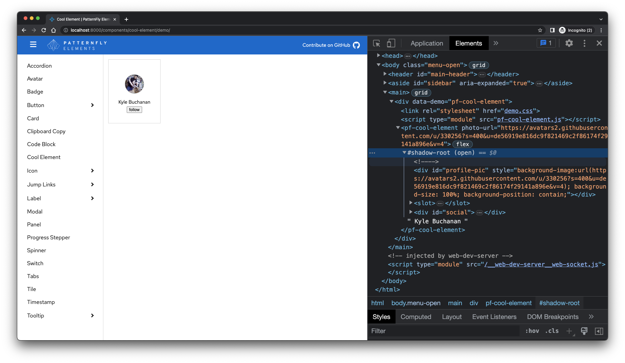
Next, we'll add a photoUrl property to pass in a profile image.
Once again, we'll use lit's @property() decorator to observe the property.
We can add a profile image with only a few updates!
Add the photoUrl property to our class' declared fields.
/** URL to the profile's avatar image */
@property({ attribute: 'photo-url' }) photoUrl?: string;
Notice that we specified a dash-cased attribute name for the property.
This follows the convention of DOM objects having camelCase names for dash-case attributes.
We don't need to specify type: String here, because that's the default for the @property() decorator,
but we do need to declare the TypeScript type of the property, and that it is optional (photoUrl?: string;)
Next, let's use lit's built-in styleMap directive to apply the background image to our profile pic.
Directives are functions which can hook into the Lit rendering pipeline. For our purposes, we can think of styleMap
as an easy way to set styles on an element from within the JavaScript context.
Import the directive.
import { styleMap } from 'lit/directives/style-map.js';Then apply it to the profile-pic element. For standard CSS properties, you can use the camelCase version of the property name.
If the value is undefined, the styleMap directive simply removes that property from the element's styles.
render() {
  const message = this.following ? 'Unfollow' : 'Follow';
  const backgroundImage = this.photoUrl && `url(${this.photoUrl})`;
  return html`
    <div id="profile-pic" style="${styleMap({ backgroundImage })} background-size: 100%; background-position: contain;"></div>
    <slot></slot>
    <div id="social">
<button @click="${this.#onClick}">${message}</button>
    </div>
  `;
}
Finally, we'll need to update our demo page (/demo/index.html) to include the photo-url attribute. Pass in an image URL to see that it's working.
<pf-v5-cool-element photo-url="https://avatars2.githubusercontent.com/u/330256?s=400&u=de56919e816dc9f821469c2f86174f29141a896e&v=4">
  Kyle Buchanan
</pf-v5-cool-element>
We can also modify pf-v5-cool-element.css to adjust the background-size property
on .pf-v5-cool-element__profile.
The final result should look like this:
Wrap-up
That's all it takes, folks! To summarize, we built a web component that extends LitElement, then added an HTML template, custom styles, and interactivity. What's cool is that we've only scratched the surface of what's possible with custom elements and Lit.
For your reference, here's the final Javascript code for pf-v5-cool-element:
import { LitElement, html } from 'lit';
import { customElement } from 'lit/decorators/custom-element.js';
import { property } from 'lit/decorators/property.js';
import { styleMap } from 'lit/directives/style-map.js';

import styles from './pf-v5-cool-element.css';

/**
 * Cool Element
 * @slot - Place element content here
 */
@customElement('pf-v5-cool-element')
export class PfV5CoolElement extends LitElement {
  static readonly styles = [styles];

  /** Whether the user follows this profile */
  @property({ type: Boolean, reflect: true }) following = false;

  /** URL to the profile's avatar image */
  @property({ attribute: 'photo-url' }) photoUrl?: string;

  render() {
    const message = this.following ? 'Unfollow' : 'Follow';
    const backgroundImage = this.photoUrl && `url(${this.photoUrl})`;
    return html`
<div id="profile-pic" style="${styleMap({ backgroundImage })} background-size: 100%; background-position: contain;"></div>
<slot></slot>
<div id="social">
  <button @click="${this.#onClick}">${message}</button>
</div>
    `;
  }

  #onClick() {
    this.following = !this.following;
    console.log('this.following:', this.following);
  }
}

declare global {
  interface HTMLElementTagNameMap {
    'pf-v5-cool-element': PfV5CoolElement;
  }
}
Out next step is to write unit test for our component so that we can use it with greater confidence.
